Moving into a compact apartment doesn't mean sacrificing style or comfort. The right color palette can completely transform how spacious your home feels, making even the tiniest studio apartment appear bright, airy, and welcoming. Whether you're settling into a cozy one-bedroom or maximizing a studio space, strategic color choices can work magic on your square footage.
Color psychology plays a significant role in how we perceive space. Light colors reflect more natural light and create the illusion of depth, while darker shades can make walls feel closer than they actually are. But the secret isn't just choosing light colors—it's understanding how different hues work together to create visual flow and maximize the perception of space.
If you're searching for apartments for rent in Wilson, NC, you'll want to make the most of every square foot. These proven color strategies will help you create a home that feels significantly larger than its actual dimensions.
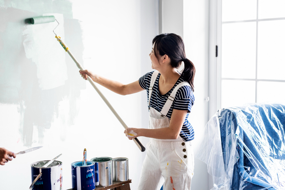
White remains the ultimate space-expanding color, and for good reason. Pure white walls reflect maximum light, creating an open, airy atmosphere that makes boundaries seem to disappear. However, an all-white room can feel stark or clinical without the right accents.
Consider these white-based approaches:
Gray has emerged as a sophisticated alternative to white, offering depth while maintaining the space-enhancing benefits of lighter tones. Light gray walls provide a neutral backdrop that makes furniture and artwork pop, while still reflecting plenty of light.
Pair light gray walls with white trim and ceilings to create visual height. This combination works particularly well in studio apartments where you need to define different areas without using physical barriers.
Warm neutral tones like beige and cream create an inviting atmosphere while maintaining the spacious feel of lighter colors. These shades work beautifully in living areas where you want to encourage relaxation and conversation.
Light blue shades can make walls appear to recede, creating the illusion of more space. Pale blue works exceptionally well in bedrooms, where it promotes relaxation while making the room feel larger. Consider powder blue, sky blue, or blue-gray for maximum impact.
Soft green tones, particularly sage green and mint, offer the space-expanding benefits of cool colors while bringing a touch of nature indoors. These hues work well in kitchens and bathrooms, where they create a fresh, clean atmosphere.
Pale purple and lavender can add personality to small spaces without overwhelming them. These colors work particularly well as accent walls or in rooms with plenty of natural light.
Using varying shades of the same color throughout your space creates visual continuity that makes rooms flow seamlessly together. This technique is particularly effective in open-plan apartments where you want to maintain cohesion between different functional areas.
Start with your lightest shade on the walls, use medium tones for larger furniture pieces, and incorporate deeper shades through accessories and artwork.
Paint your walls in a slightly lighter shade than your ceiling to draw the eye upward, creating the illusion of height. This subtle gradient effect can make standard eight-foot ceilings appear taller without being obvious to visitors.
While conventional wisdom suggests avoiding dark colors in small spaces, a single accent wall in a deeper shade can actually create depth and dimension. Choose the wall farthest from the main entrance to draw the eye through the space, making it appear longer.
This classic coastal combination creates an open, airy feel reminiscent of ocean and sky. Use white as your primary color with light blue accents through textiles, artwork, and decorative objects.
Soft gray walls paired with bright yellow accessories create a cheerful yet sophisticated atmosphere. The yellow adds warmth and energy while the gray maintains the space-expanding benefits of neutral tones.
This natural combination brings outdoor freshness inside while maintaining a spacious feel. Use cream as your base with sage green accents in plants, throw pillows, and artwork.
Complement your color choices with strategic use of mirrors and reflective surfaces. Large mirrors positioned opposite windows reflect natural light and outdoor views, effectively doubling the visual space of your room.
Glossy paint finishes, while showing more imperfections, reflect more light than matte finishes. Consider using semi-gloss or satin finishes in small bathrooms and kitchens where maximum light reflection is beneficial.
Your color choices work hand-in-hand with lighting to create the illusion of space. Natural light enhances the space-expanding effects of light colors, so keep window treatments minimal. When natural light is limited, incorporate multiple light sources at different heights to eliminate shadows and create an even, spacious feel.
LED bulbs with daylight color temperatures (5000K-6500K) complement cool color schemes and make spaces feel more open during evening hours.
Many people make the mistake of using too many different colors in small spaces, creating visual chaos that makes rooms feel cramped. Stick to a cohesive palette of three to four colors maximum.
Another common error is neglecting the ceiling, which many consider the "fifth wall." Painting your ceiling the same color as your walls or in an even lighter shade eliminates visual breaks that can make spaces feel smaller.
The key to successfully using color in small spaces lies in understanding how different hues interact with light, furniture, and architectural features. Start with your largest surfaces—walls and ceilings—then build your palette through furniture, textiles, and accessories.
Remember that personal preference matters too. While these strategies provide a foundation for making spaces feel larger, you should still choose colors that make you happy and comfortable in your home.
Ready to put these color strategies to work in your new home? If you're looking for apartments for rent in Wilson, NC, contact Oasis at Heritage today to schedule a personal tour and discover spaces perfect for your design vision.